Profile packaging
GUIDE
For those who want to work and earn on Instagram and develop their account as an Expert
For those who want to work and earn on Instagram and develop their account as an Expert
Before you start your blog, you need to decide on the following:
- Purpose - why do you have a blog/profile/account?
- The topic of the blog - what are you going to show? Strategy is formed from here on how you will run your blog.
90% of novice bloggers fade in the first month of working on a blog, as they get emotional burnout amid the fact that they are not interested in the topic they chose to develop their blog. They stop liking what they have done and what they have created this month already.
If you’re already here, it’s not about you! Follow the recommendations, and your start will be as productive and successful as possible.
TOPIC. GOAL. STRATEGY.
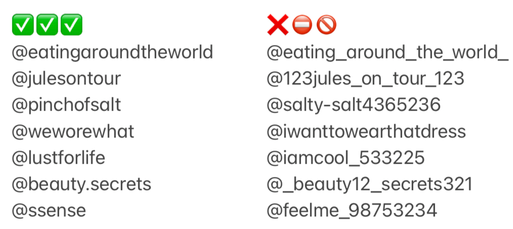
USERNAME
- Simple
- Catchy
- Thematically correct
- Not too long
- Not including numbers and strangely spaced dots and underscores
MAIN PHOTO
Remember: Good clothes open all doors. First impressions are crucial. They can make or break an opportunity. Humans make a judgement about someone when they first meet them; it’s simply human nature. It takes less than 20 seconds to formulate an opinion about you; therefore, making this opinion “positive” is essential.
Photo requirements for an expert, blogger or personal account - a portrait up to the waistline. It is forbidden to use full-length photos, photos in groups of other people, cartoon avatars and emoticons, and photos in poor quality and lighting.
If this is a company profile, it is allowed and preferred to put a company logo.


NAME
People can find your profile by typing your name or niche into the Instagram search engine. The name is the bold line below your profile picture. For example, you are a hairdresser, and by adding “hairdresser” into the name section, the person looking for a hairdresser will find your profile, bringing you a ready-made potential client.
Your name should include the service that you provide that your target audience will be looking for. Also, beneficial can be the city where you are based.
Your name should include the service that you provide that your target audience will be looking for. Also, beneficial can be the city where you are based.
Interesting!
The name should be written in bold and needs to stand out. When you land on someone’s profile, this catches your eye first. To make it brighter and more noticeable, I recommend writing in caps lock, as large letters are even more striking to potential customers or new followers.
Important!
The name can be up to 30 characters long! The name change is allowed only up to two times within 14 days.
BIO - HEADER
Indicate who you are, what you do, and where you are based, why people should follow you. Then, add a call to action; for example, “download my free guide”. It is beneficial to add a link to your messenger or website. When making the profile header, do not forget about readability and clarity of perception.

A few basic design rules
- Every new sentence and thought - from a new line
- Do not get carried away with emojis and unusual fonts
- Don’t forget spaces
- Take care of spelling and grammar
Useful! The Instagram functionality does not allow you to draft inside the application; as a result, everything will be messy. I recommend writing and styling everything in the notes on your phone and then copy-paste it into Instagram.
The bio section contains a maximum of 150 characters.
The bio section contains a maximum of 150 characters.
The bio section should contain a unique selling proposition or offer, making new followers stay on the profile. Offer = benefit + product or service + promotion or discount + call to action. A unique selling proposition is part of the competitive advantage based on which the client chooses a company or product.
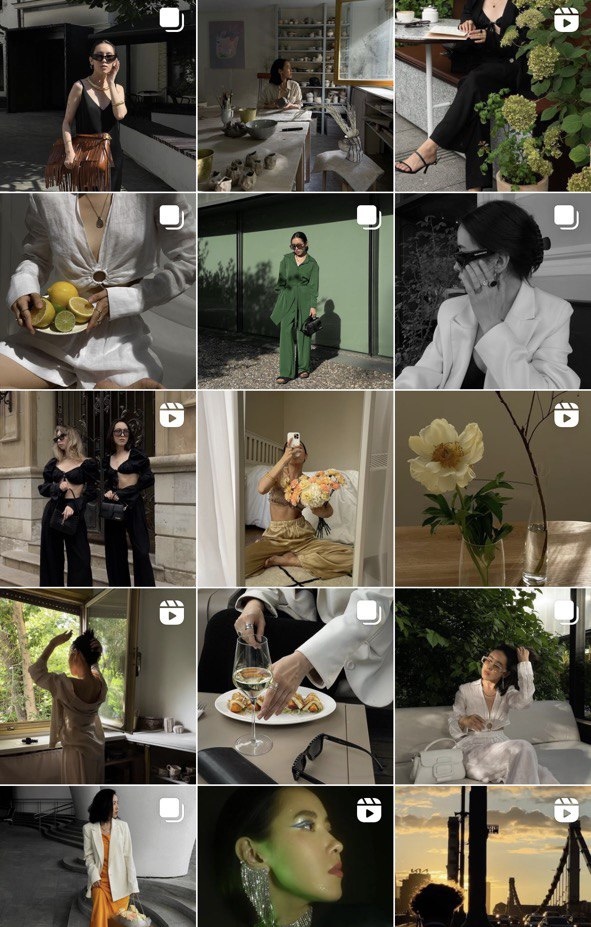
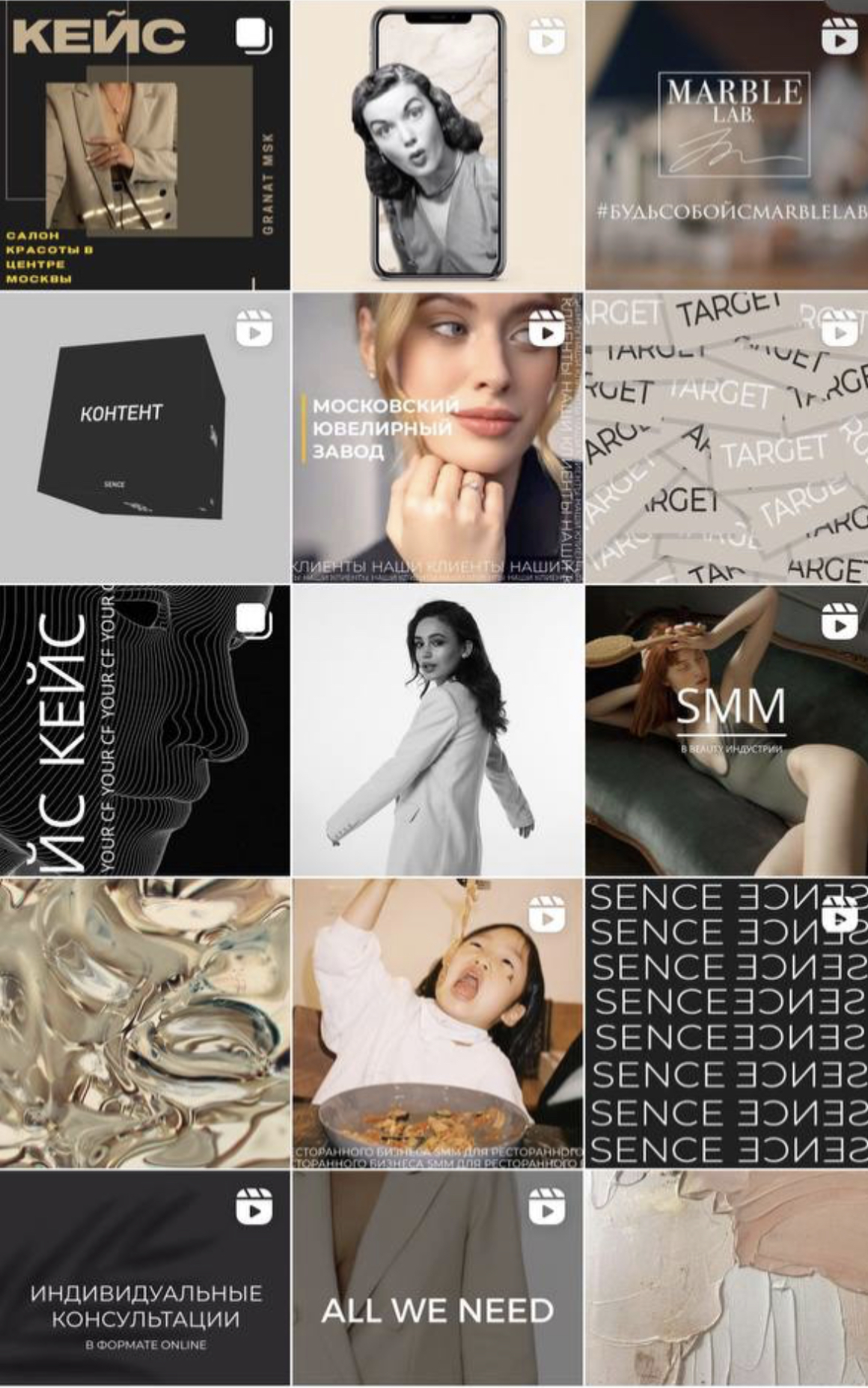
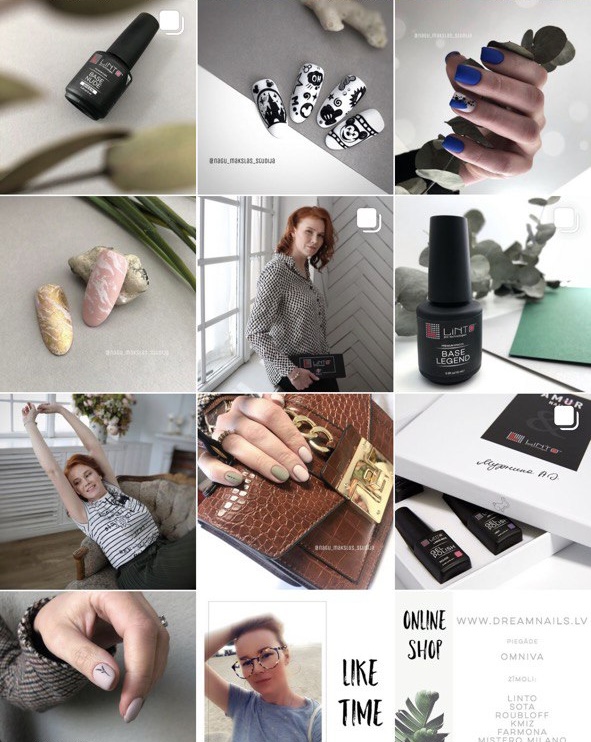
VISUAL
Visual design
The audience is tired of the monotonously stuffy shots from the photo studio, especially if the entire feed is from one photo shoot or unnatural poses and staged.
Trend number one: live shots - not staged photos.
Trend number two: minimum editing - maximum naturalness, minimum retouching, no heavy-changing colour presets.
Trend number three: carousel - use a carousel in posts, and then it will appear twice in the feed.
Important! One of the easiest and best ways to enhance your photos is to include camera grid lines. Camera grid adds a series of lines on your phone’s screen, based on the “rule of thirds” - a principle of photographic composition that says that an image should be split into three parts horizontally and vertically.
To turn on the grid on your iPhone: Go to settings, go to Photos & Camera, and turn on the grid.
On Android: Open the camera app, scroll down and turn on the grid.
The focus on the subject is also very important. Most good photographs focus on one interesting subject. Therefore, spend a little more time on an interesting angle. Remember the one-third rule. Touch your phone’s screen for the camera to focus and optimise the light.
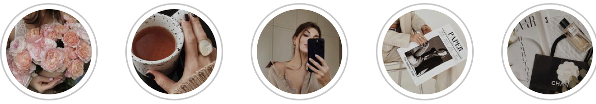
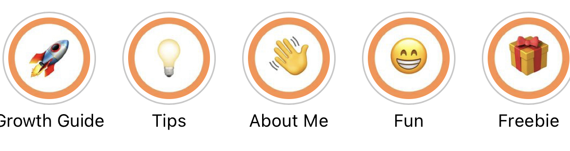
HIGHLIGHTS COVER
There are a lot of Highlights covers and their variations, be creative and create “your own”.
Strange icons, the same type of covers, and the repeating logo are not a good choice for the highlights covers. Instead, look at other blogs, and develop visibility, because this is the only way a style is born.
Strange icons, the same type of covers, and the repeating logo are not a good choice for the highlights covers. Instead, look at other blogs, and develop visibility, because this is the only way a style is born.


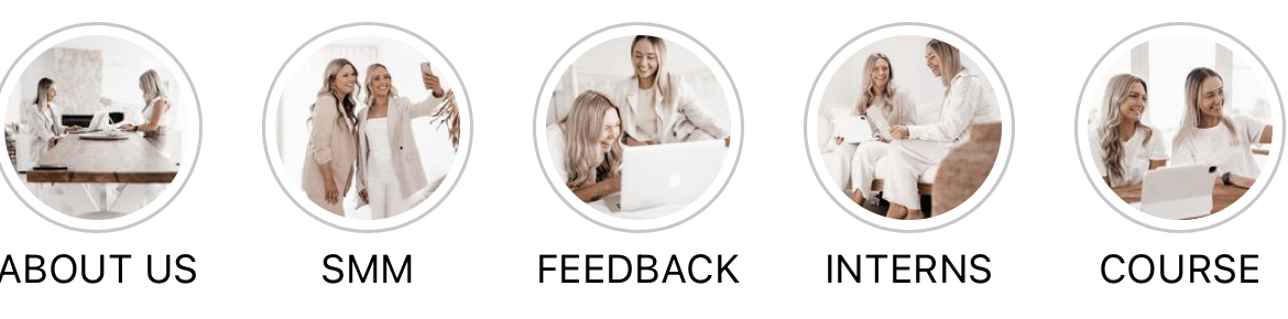
HIGHLIGHTS
Highlights are the most reliable way to keep followers who first came to your profile. This is where you can store the essential information about your business/blog.
What information is essential? It depends only on you and the theme of your account:
What information is essential? It depends only on you and the theme of your account:
Services - a catalogue with types of services and prices, photos before and after, and customer reviews.
Product business: assortment, collections, price list, customer reviews.
Personal blog - add the main headings: recipes, children, reviews, travel, and refurbishment.
Do not pile up saved stories; leave only what is the backbone of your blog here.
Product business: assortment, collections, price list, customer reviews.
Personal blog - add the main headings: recipes, children, reviews, travel, and refurbishment.
Do not pile up saved stories; leave only what is the backbone of your blog here.
PROFILE COLOURS
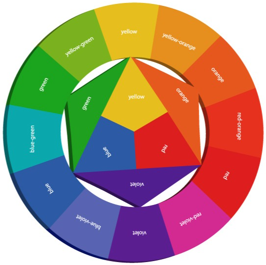
It is important to combine colours harmoniously. Use the Itten colour wheel. How it works: in the centre of a triangle are primary colours - blue, yellow and red.
Mixing two of the three primary colours gives you secondary colours. For example, yellow with blue produces green, yellow with red makes orange and blue with red gives purple.
There are also tertiary colours in the circle. According to the scheme, they are obtained when a secondary colour appears adjacent to each other.
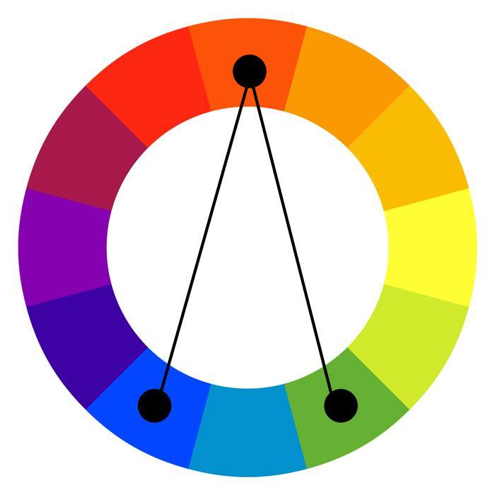
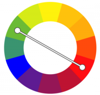
Complementary
The Itten colour wheel helps to select balanced colour coverage. Several usage patterns cover the most popular ones.
The colours are opposite each other; when you want to choose a specific colour in the design, its pair is strictly opposite. This allows us to get cool and high-quality colour pairs and pay attention to them.
A classic triad is selecting colours on a circle in an even triangle. In such a scheme, it is better to take one of the colours as the basis of various arrangements.
Split Complementary/ Classic Triad

Profile optimisation checklist
- Easy-to-remember username
- High-quality, close-up picture
- Searchable name with niche keywords
- Clear bio
- Highlights about you, your services
- Content that reflects your statement in bio
Use this knowledge to design stories, advertising creatives and spectacular designs. The harmonious combination of colours, design and packaging will sell on your behalf “without selling”.